Typical websites now get over 20% of their traffic from mobile phones, some much more. Having your content work well on a range of devices is now a real necessity of the modern web.
When starting a new website we encourage all of our clients to have their site developed in a way which works well on all devices. Allowing text and images to reformat themselves in a way which makes the content readable on many screen sizes.
Responsive Images Auto Resized on Our Server
Using a technology known as 'source set', we are able to generate a range of resized images for every image you include on your web page. The device you use then requests the image most appropriate for the screen size you are viewing the website on. This means mobile website can often download less than a third of the data of their desktop counterparts by only downloading smaller versions of all the images included in your site. This obviously makes your site load quicker, but also uses less of your users often limited mobile transfer allowance.
Mobile Menus
Screen space is obviously very limited on mobile devices. When screen width dips below a certain level we typically remove the main navigation element from your site and replace it with a more compact, pop out or slide in menu.
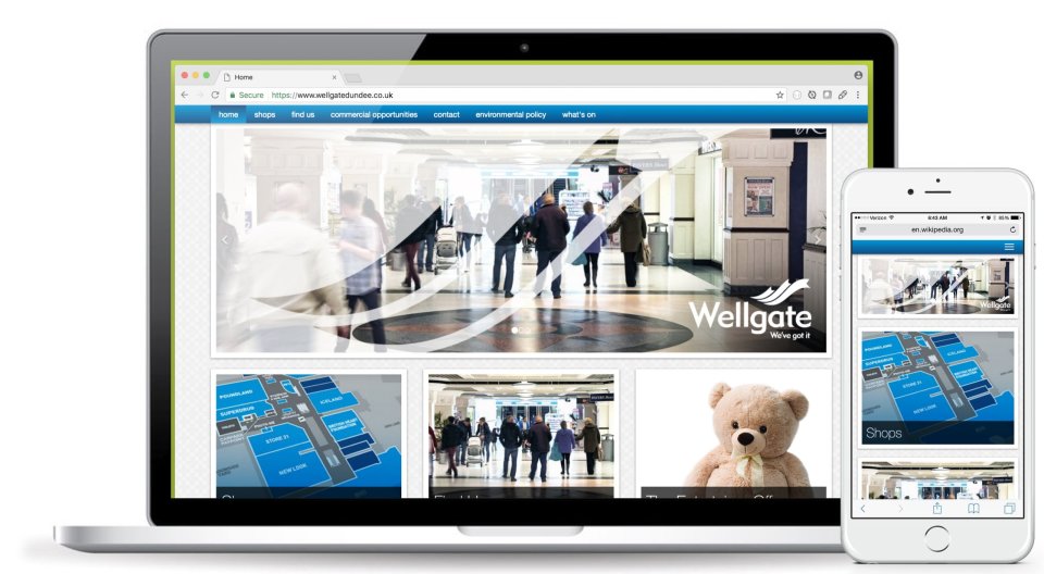
Responsive Preview
Responsive preview within the CMS system allows you to see your site and how it would appear on a range of devices.
This site uses cookies that enable us to make improvements, provide relevant content, and for analytics purposes. For more details, see our Cookie Policy.
By clicking Accept, you consent to our use of cookies by us and third party code embedded within this site.
To change your consent, click the "Update Cookie Consent" link at the bottom of the webpage at any time.